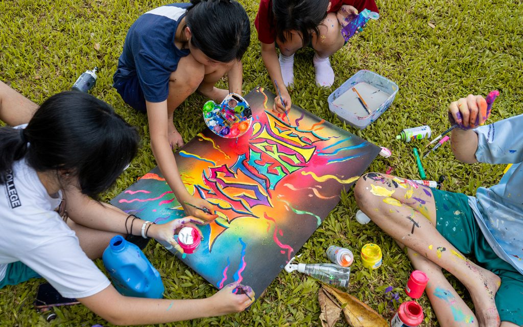
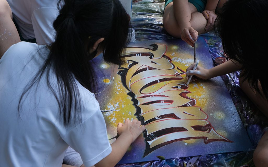
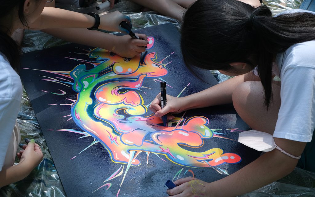
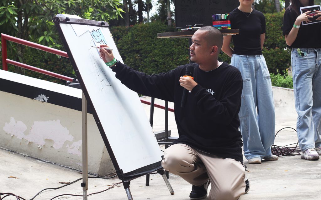
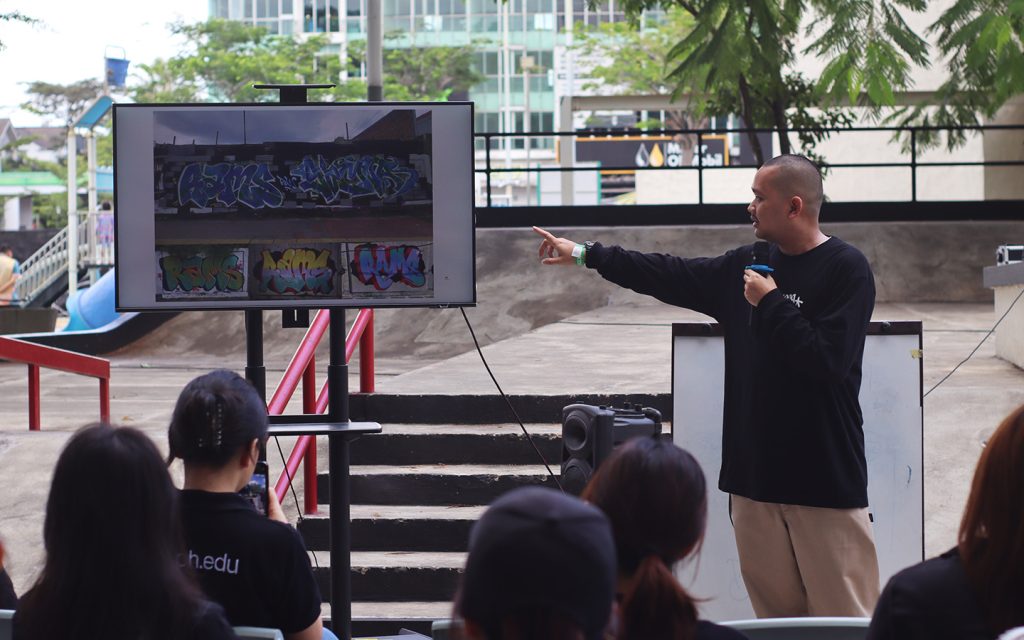
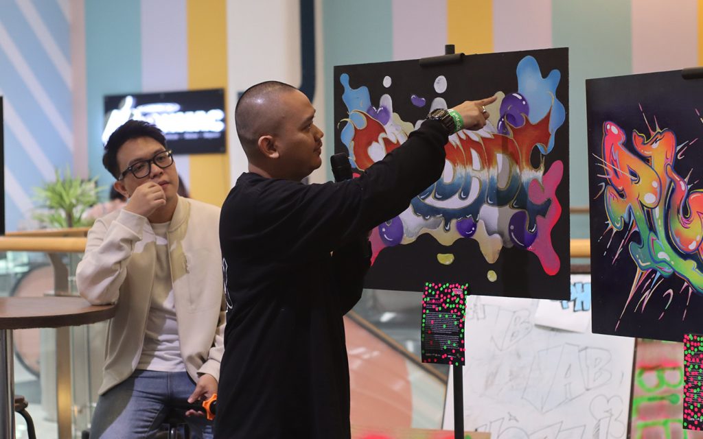
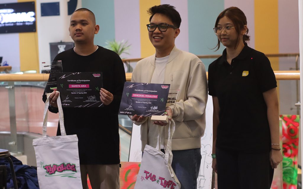
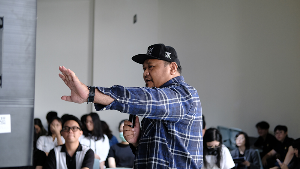
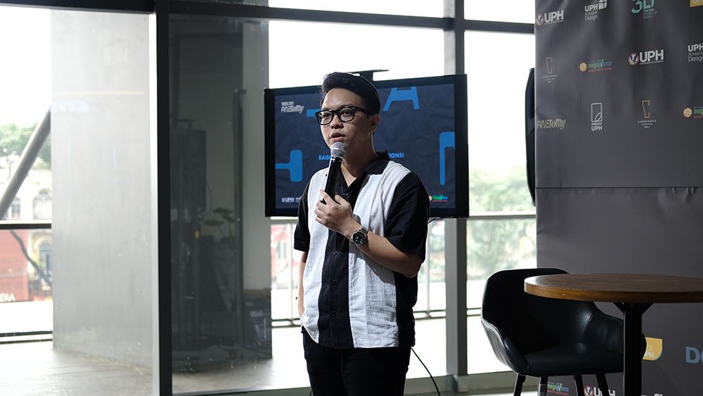
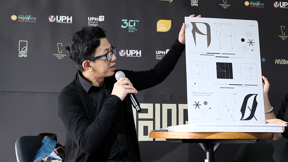
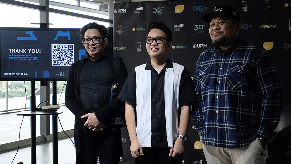
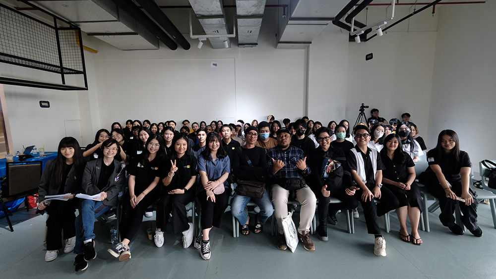
Typolog 2025 was recently held from May 10th and May 12th to 17th, 2025, at Scientia Square Park, Gading Serpong. The event featured a mural typography competition, seminars, work critiques, and workshops conducted by two outstanding mentors: Ramsta Aria and Yehezkiel Penalosa, one of our alumni.
Check out some photos and documentation from Typolog 2025 below.
We would like to thank Ramstra Aria and Yehezkiel Penalosa for their time at our event. We would also like to thank Scientia Square Park for supporting our event. Lastly, thank you for all the participants of this event. We hope to see you in the next event!
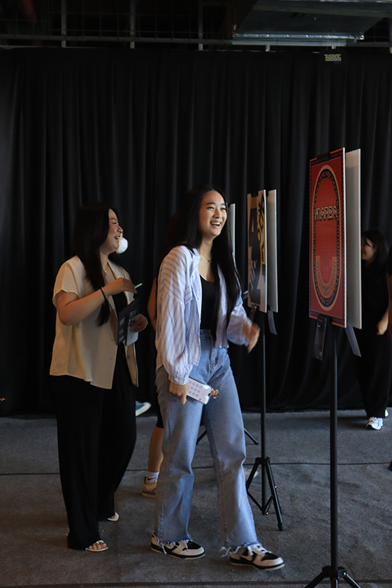
The Hear Us Out exhibition was successfully held from March 3-7, 2025, in Room B 301. The event was officially opened on Monday, March 3, 2025, and attended by DKV students eager to explore the best poster designs showcasing typography experimentation.
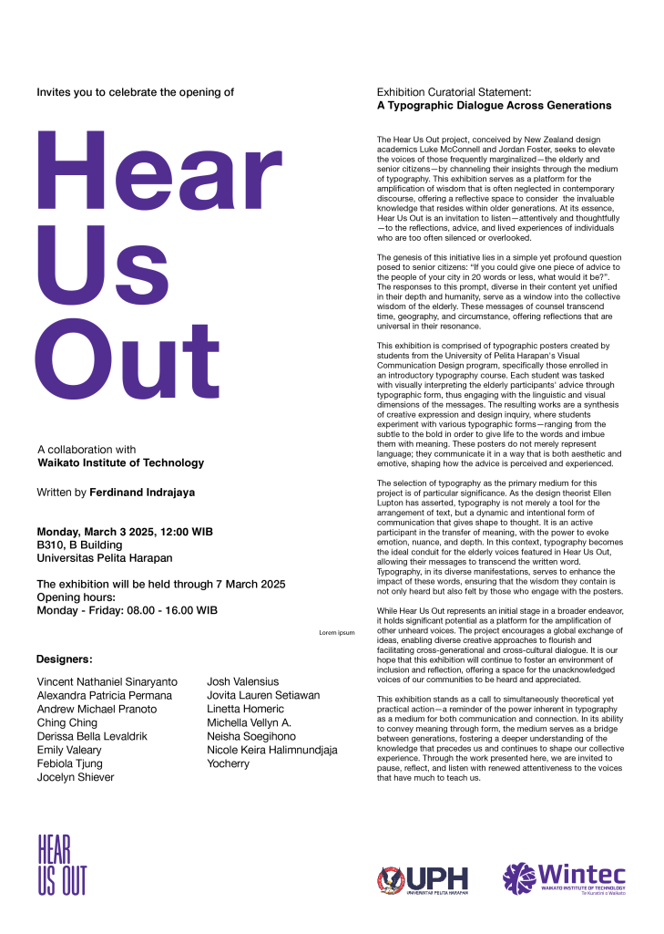
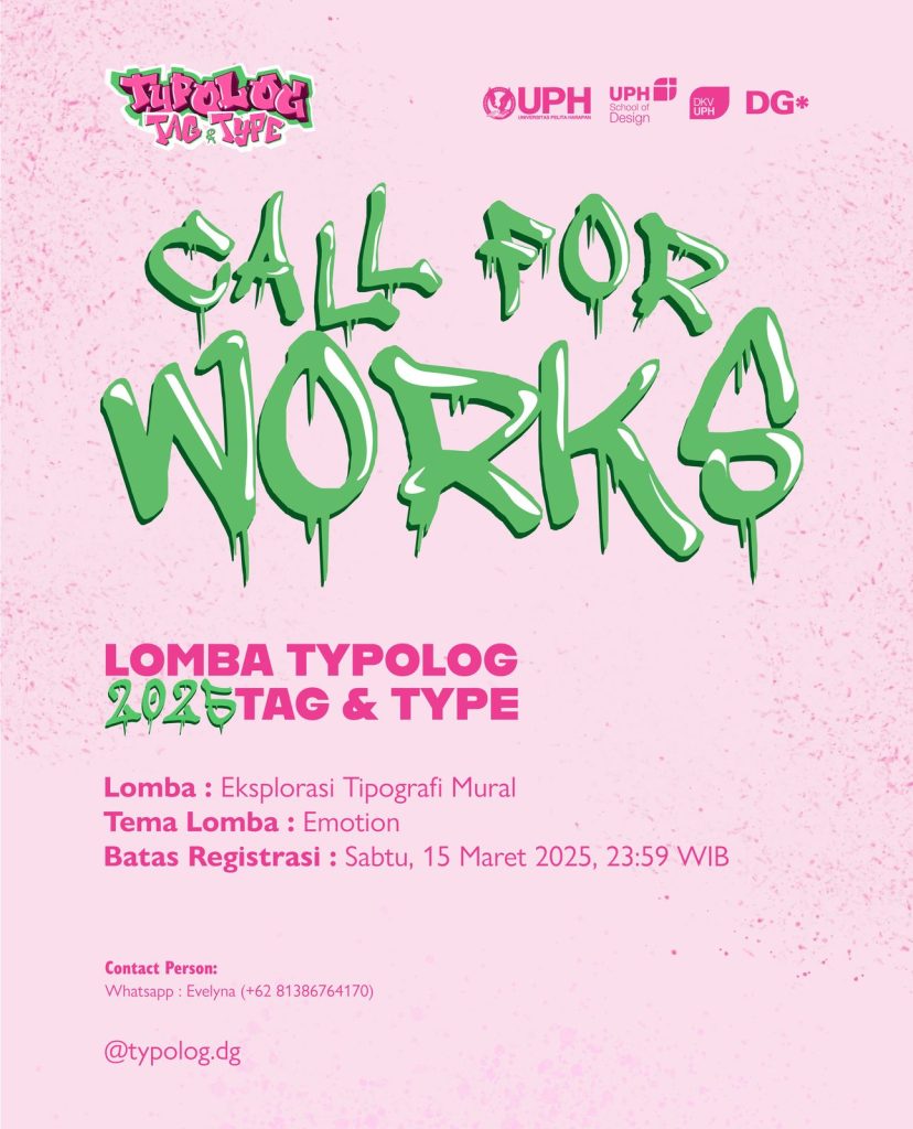
Poster for Hear Us Out Exhibition
The posters displayed in this exhibition were created by students as part of their exploration in the Introduction to Typography class. Throughout the course, students experimented with various typographic elements, compositions, and visual storytelling techniques to communicate messages effectively through design. This process allowed them to develop a deeper understanding of typography’s role in visual communication.
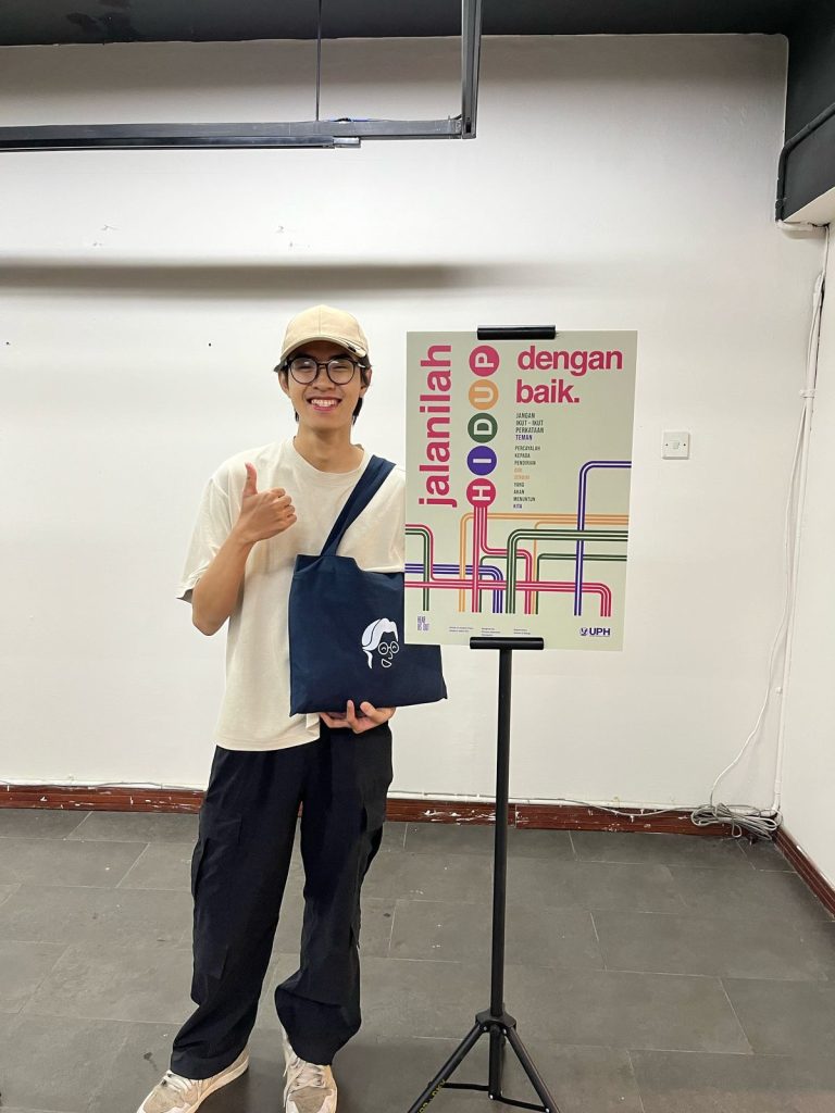
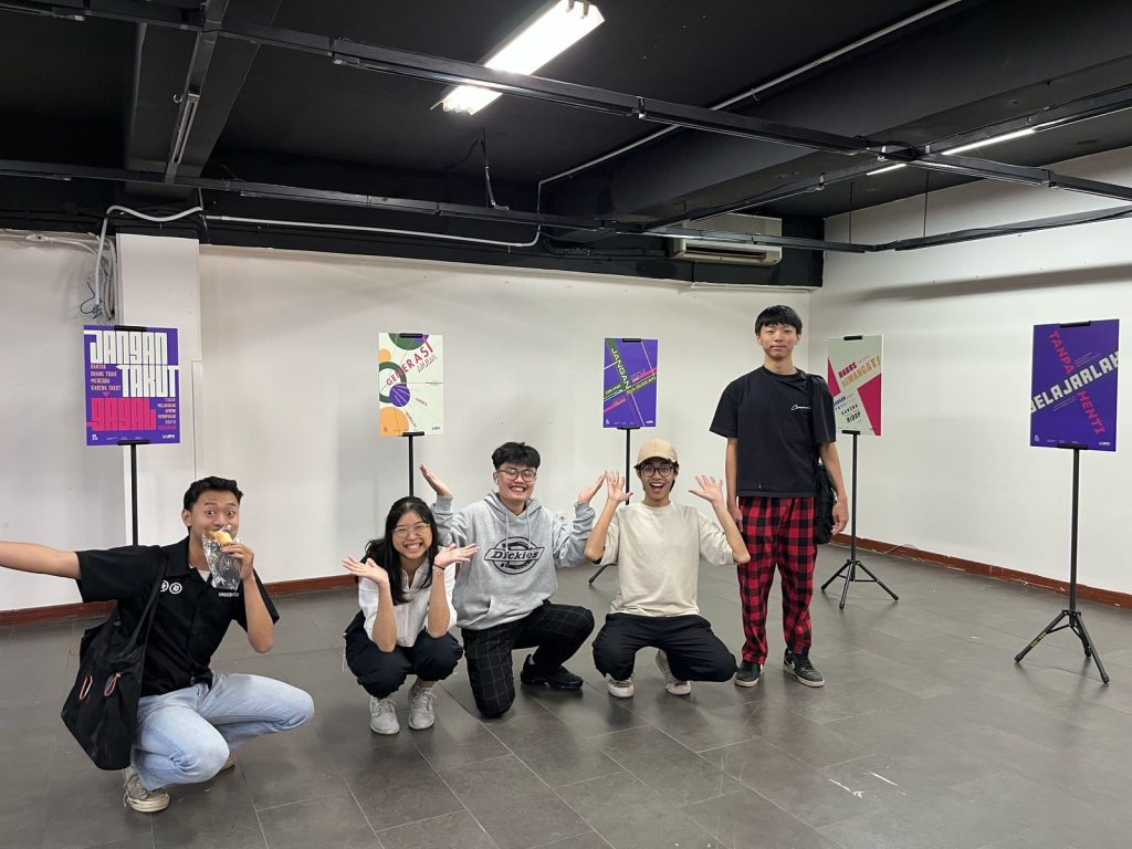
One of the student participants with their work at the Hear Us Out exhibitionStudent participants of the Hear Us Out exhibition
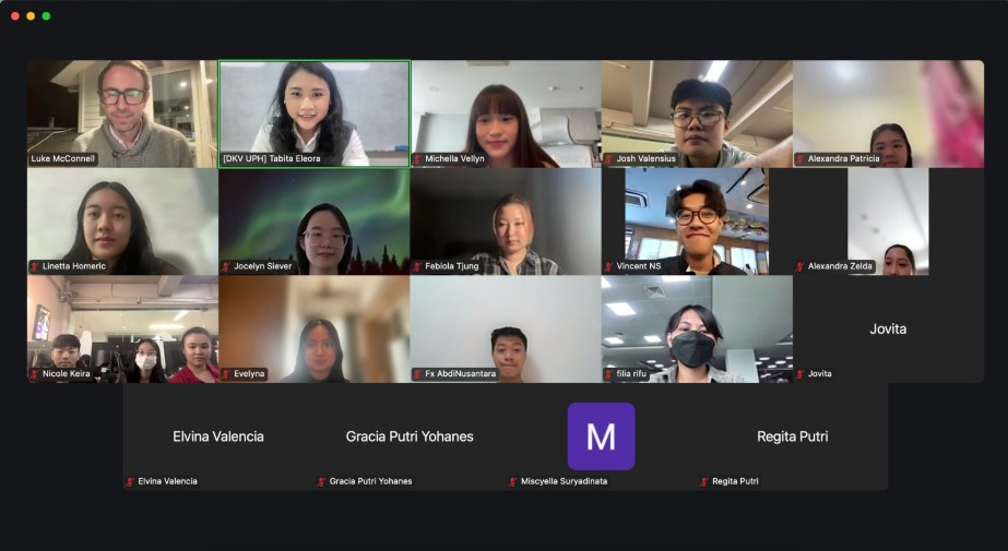
Following the exhibition, an online review session was conducted with Luke McConnel from Waikato Institute of Technology (Wintec), our collaborative partner. This session provided a valuable opportunity for students to receive direct feedback from Luke. The students’ enthusiasm was evident, as they actively engaged by asking insightful questions about typography in their poster designs.
Group photo from the online review session with Luke
A big thank you to everyone who participated and supported this event. Special appreciation to Luke McConnel and Wintec for their valuable insights and collaboration. We look forward to more partnerships like this in the future to further enrich design communication at UPH!
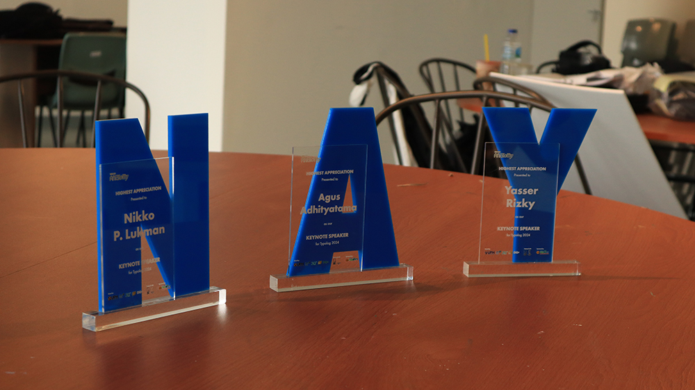
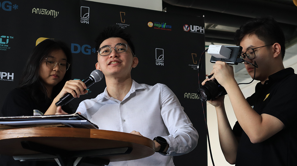
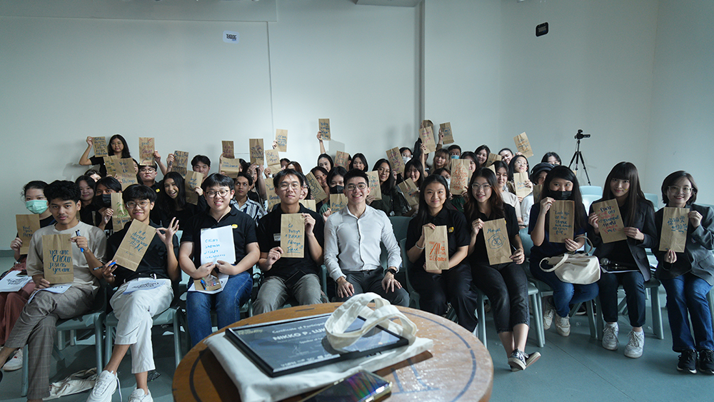
Typolog 2024 was recently held from June 15th to 22nd, 2024, at Carstenz Mall, Gading Serpong. The event featured a typography poster competition, seminars, work critiques, and workshops conducted by three outstanding mentors: Nikko Purnama Lukman, Agus Adhityatama, and Yasser Rizky.
Check out some photos and documentation from Typolog 2024 below.
On Saturday, June 15, 2024, the Graphic Design concentration of VCD UPH held Typolog 2024. This event is part of a series of activities organized at Carstenz Mall, Gading Serpong, as part of Typolog 2024.
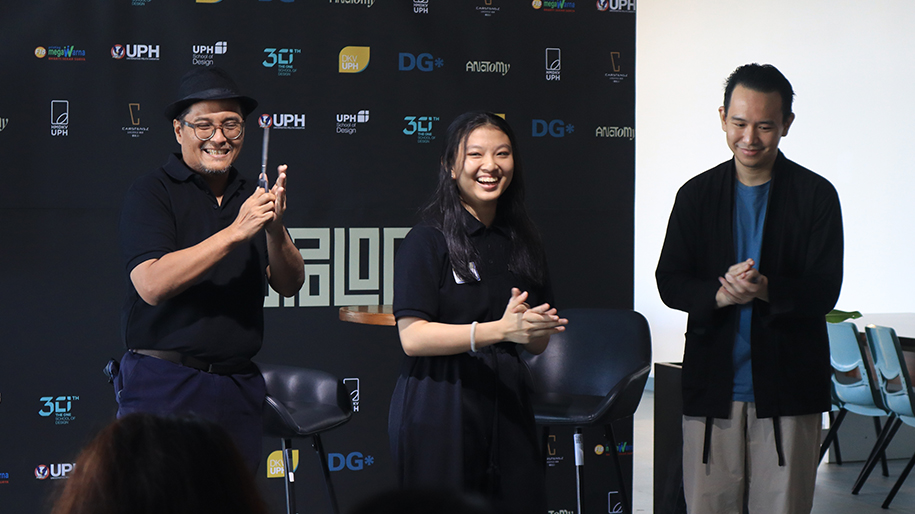
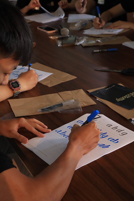
The workshop at Typolog 2024 focused on calligraphy and was led by VCD UPH alumnus Nikko Purnama Lukman. Nikko has previously conducted several sessions in Typolog’s webinars and online workshops in past years.
Nikko Purnama Lukman at Typolog 2024
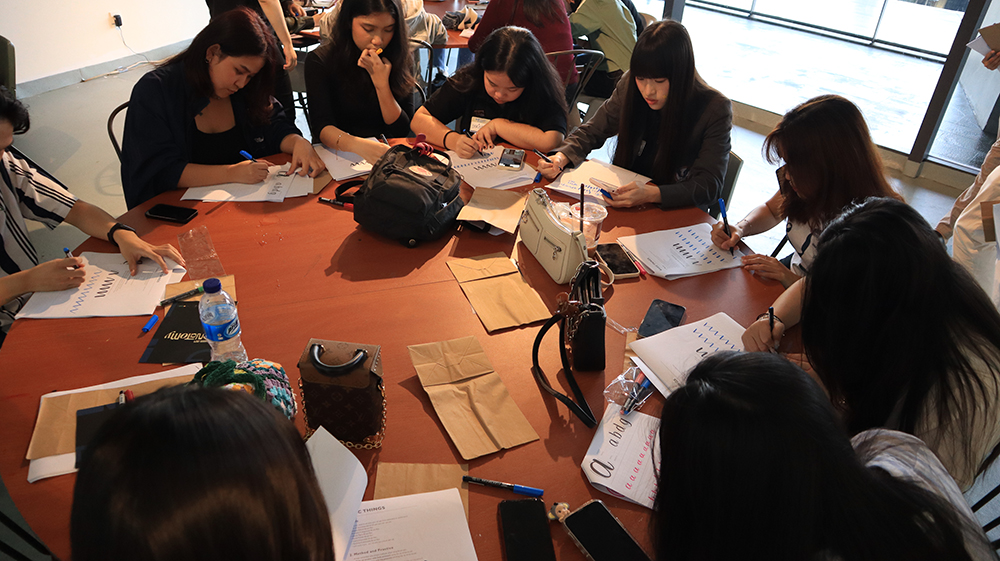
The calligraphy workshop was well received by both the organizers and the participants. Nikko’s relaxed approach to teaching calligraphy provided an insightful introduction to the basics and the enjoyment of calligraphy as a visualization technique useful for designers.
Nikko and the Participants of the Workshop
Thank you, Nikko, for sharing your time and expertise at Typolog 2024.
Hello, my name is Fredella Agatha. I graduated with a degree in Visual Communication Design (DKV) from UPH in the class of 2018, specializing in graphic design. Currently, I work as a graphic designer at a marketing agency. In addition to my professional activities, I also nurture my hobby and interest in the field of typography by working as a freelance type designer.
Before enrolling in the Visual Communication Design program at UPH, I had little knowledge about graphic design – terms like balance and harmony in composition were unfamiliar to me. All I knew was that I enjoyed drawing. However, such skills alone were not sufficient to thrive in today’s design industry. Throughout my studies at UPH, I received guidance in both hard and soft skills. Here, we were not only shaped into competent and outstanding designers but also encouraged to have broad knowledge and remain open to learning new things.
Every course in the DKV program at UPH has left a significant impact on me, particularly Basic Typography and Experimental Typography. Basic Typography was the class that awakened my interest in the world of typography, while Experimental Typography inspired me to try creating my own font for the first time. Besides these two classes, one of the most memorable courses was the Main Studio, where I learned the fundamentals of graphic design and design semiotics. We were taught how to create work that is not only visually appealing but also meaningful, capable of effectively communicating messages and relevant to contemporary contexts.
My academic journey at DKV UPH has been an immensely enjoyable experience. Overall, I am highly satisfied with the campus environment and the facilities provided. Students are not only given the opportunity to learn in the classrooms but are also encouraged to participate in various organizations or communities. Additionally, the courses taught are relevant to the professional world, serving as a bridge as I entered the industry. This is undoubtedly a result of the dedication and efforts of the lecturers who wholeheartedly guide their students. I hope that this experience is not only cherished by me but is also shared by many other students out there. I highly recommend DKV UPH to students who are pursuing their passion in the field of design.
Fredella Agatha is an experienced graphic designer with 1.5 years in the industry, currently working remotely for a marketing agency overseas. Her expertise lies in crafting visually compelling designs that resonate with clients. Outside of her professional role, Fredella has a deep passion for typography, particularly in type design, which has become one of her favorite hobbies, offering a creative escape after long workdays.
“When you really want something, the whole universe conspires in helping you to achieve it.”
Paulo Coelho
See Fredella and other of our alumni projects here.
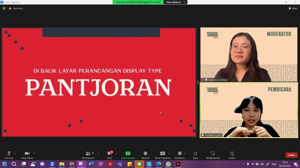
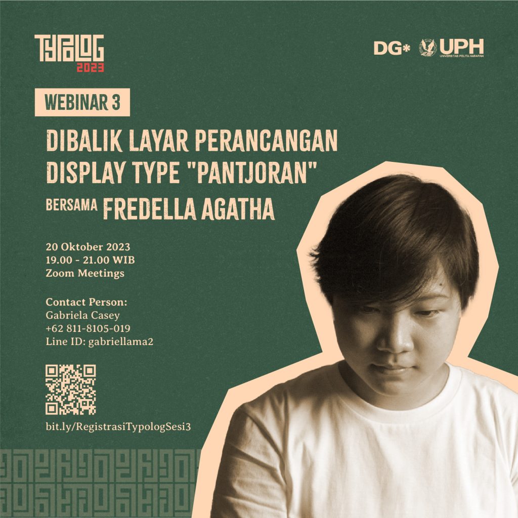
On Friday, October 20, 2023, the Graphic Design specialization at UPH conducted the Typolog 3 Webinar with an alumni speaker from VCD UPH itself, Fredella Agatha. In this event, Fredella shared her experience in designing the ‘Pantjoran’ lettering as her final project. Fredella explained the process and also shared tips on lettering design with all the webinar participants.
Fredella Agatha, The Speaker for the Webinar, and Yolanda Tumilisar, The Moderator for the Webinar
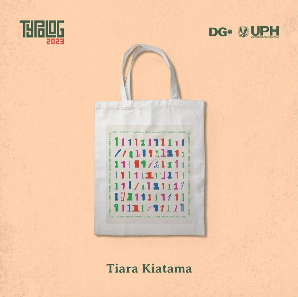
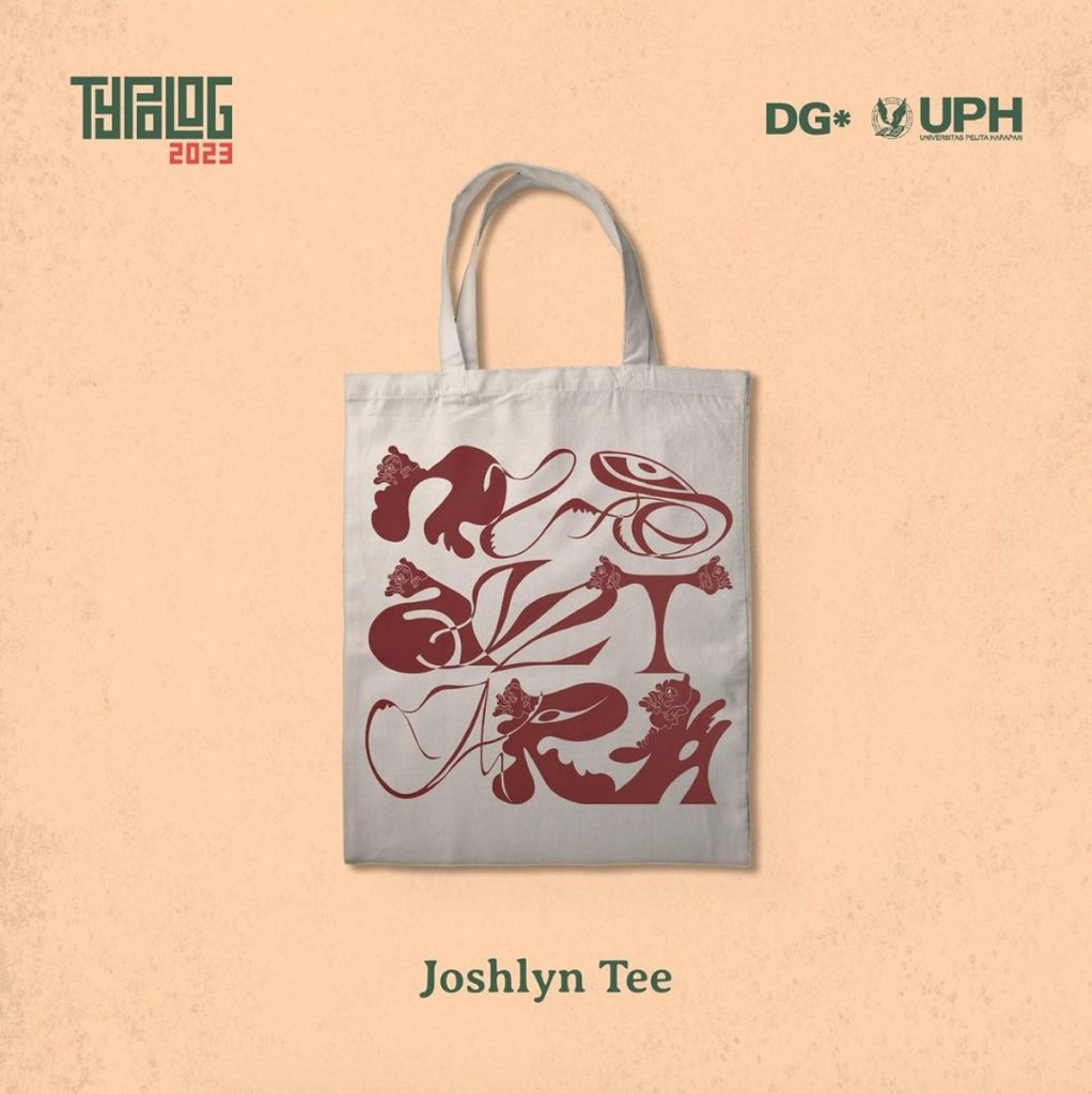
In addition to Fredella’s sharing session, the Typolog 3 Webinar also featured the announcement of the winners of the Typolog 2023 competition. The Typolog 2023 competition challenged participants to create designs in the Tote Bag format, which would later be produced as merchandise by VCD UPH. The grand winner of the Typolog 2023 competition was Tiara Kiatama, a student of VCD UPH from the 2022 batch. Meanwhile, the favorite winner of the Typolog 2023 competition was Joshlyn Tee from UPH College.
“Berbeda-beda Tetapi Tetap Satu” by Tiara Kiatama
This work emerged from the exploration of the definition of “Nusantara,” which is a synonym for describing the unity of the Unitary State of the Republic of Indonesia introduced by Ki Hajar Dewantara in 1950. Nusantara refers to the unity of several islands, which I combined with Indonesia’s official motto, “Bhineka Tunggal Ika,” which means “Diverse But One.” The diversity of Indonesia, comprising various provinces, ethnicities, cultures, and religions, is the uniqueness of the Indonesian nation itself.
This concept resulted in this work, a collection of diverse typefaces, yet still displaying the number one. Diversity was also achieved through the use of different colors, but there was still a unifying element, including its placement within a text “box.”
This is my interpretation of the theme ‘Nusantara’ provided.
“The title of this work is Nusantara. This typographic work is inspired by the cultural diversity of Indonesia and draws inspiration from the art of wayang puppetry. Each letter in the word ‘Nusantara’ is inspired by the different shapes and styles of wayang characters. I attempted to incorporate the unique features and characteristics of various wayang characters into each letter. I also used wayang puppet heads in some of the letters. I played with the thin and thick aspects of the wayang figures and used them in letter composition to create an engaging design.
I created each letter’s sketch individually and drew inspiration from the trendy ‘molten chrome typography’ and sharp typography seen on various social media platforms because I believed this style was suitable for the wayang aesthetics. In the modern world, we often get caught up in new trends and things happening around us, and we tend to forget our rich and diverse culture. So, I incorporated trendy typography styles like combining different font styles into one text and experimenting with the typography composition to make Indonesian culture modern and trendy.”
Thank you to all participants, organizers, and everyone who participated during the Typolog 2023 event. Hopefully, we can meet again in Typolog or other activities.
Typolog 2023 is hosting its third webinar of the year titled “Behind the Scenes of the ‘Pantjoran’ Display Type Design with Fredella Agatha.” Fredella Agatha is one of the alumni from VCD UPH who chose a type design project as her final project. Now, she’s returning to share her experiences in the Typolog 2023 webinar.
This webinar will take place on October 20, 2023, from 7:00 PM to 9:00 PM WIB (Western Indonesia Time). Please register through https://bit.ly/RegistrasiTypologSesi3.
Photo of Tiffany Wong. Photo Provided by Tiffany Wong
My name is Tiffany Wong. I’m an alumna of DKV UPH, with a concentration in DG, from the batch of 2017-2021. Currently, I am working as a freelance graphic and book designer while also pursuing my passion for print through “sore sore,” an indie publishing platform. My practice explores how personal experiences and emotions are represented by tangible objects alongside written language.
I entered DKV UPH with little to no knowledge of the graphic design world. As far as I knew, I only wanted to have the ability to communicate with visuals, as their brochure advertised that academic year. With only a basic skill in drawing typography, I was amazed when I learned that this skill was just the tip of the iceberg in the graphic design world. Nevertheless, I was thoroughly guided through it, with classes and programs that taught me more than enough to thrive in the industry.
Looking back at my days in DKV UPH, I can’t choose a favorite class as I see them all as a holistic experience that I cherish. However, two that were particularly momentous for me are Main Studio 1 and Experimental Typography. Main Studio 1 was when I first discovered my passion for book design, which I now pursue wholeheartedly. Experimental Typography, on the other hand, was when I delved deeply into the essence of graphic design. It was probably when I achieved the ability to communicate with visuals, fulfilling my freshman dream.
I must say that not only did I gain knowledge and new skills, but my time studying in DKV UPH was also a journey of self-discovery. As I learned the many elements of the graphic design world in my classes, I was also guided to nurture my passion. The lecturers and the learning environment at DKV UPH were nothing but supportive. I hope that many more students can experience this once-in-a-lifetime journey, as I did.
Tiffany Wong currently lives and works in Jakarta as a graphic designer, art director, and visual artist. She previously worked as a graphic designer for Artnivora and Jakarta Film Week, as well as the visual communication designer for Orasis Art Space. Her work has been featured on Behance in the InDesign and Editorial section and in Madrid Grafica 2021.
Tiffany specializes in editorial and book design, where she explores language and words in relation to the book as an object. Her deep admiration for individual experiences and the natural world has led her to create works deeply rooted in romanticism, described by some as ‘poetic,’ ‘raw,’ and ‘whimsical.’
“At the end of the day, it isn’t where I came from. Maybe home is somewhere I’m going and never have been before.” ― Warsan Shire
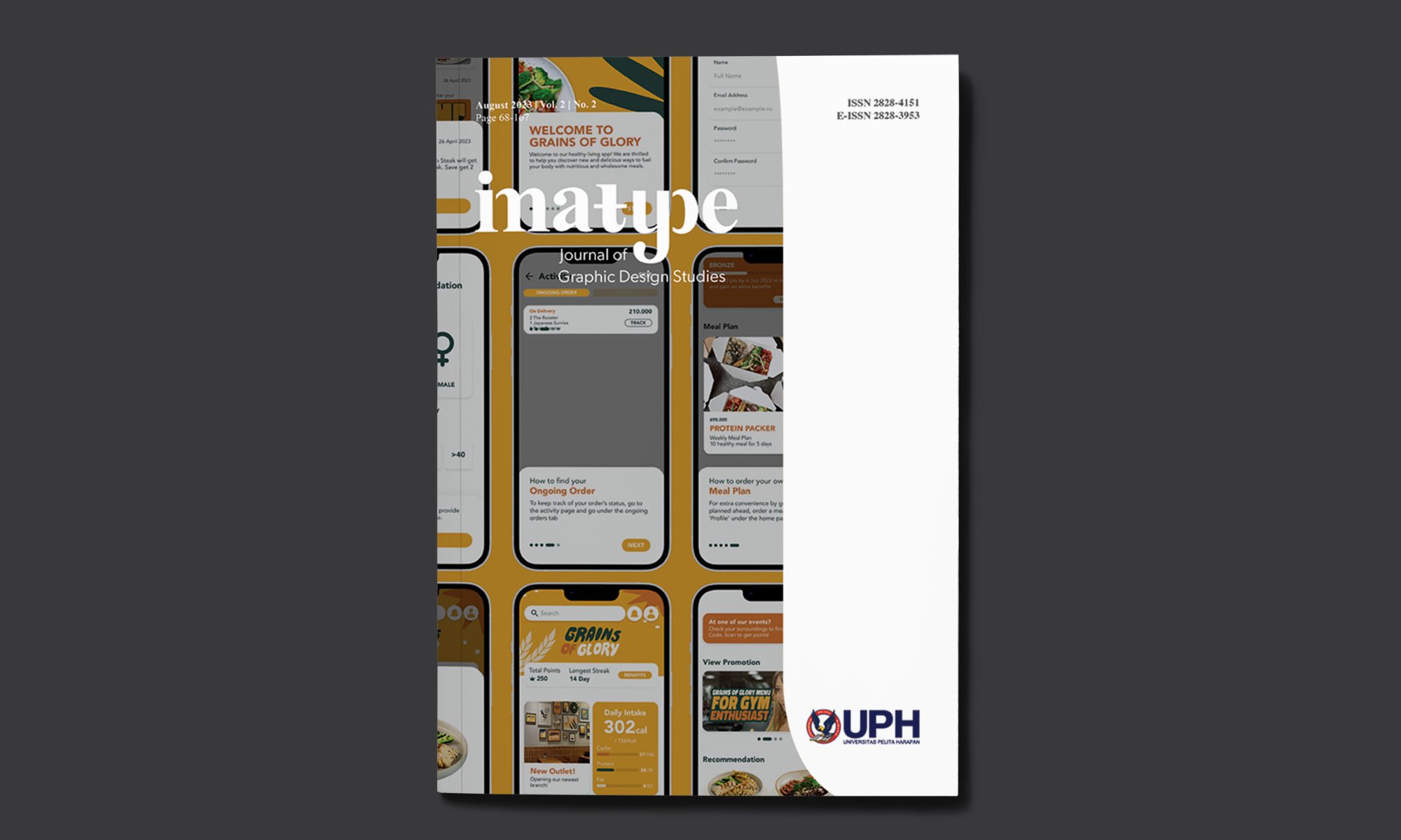
IMATYPE: Journal of Graphic Design Studies, Volume 2, Number 2, has just been published. This academic journal is a collaborative effort between the Graphic Design concentration and the Editorial & Publication Design Lab of Universitas Pelita Harapan (LABDEhttps://labdep.uph.edu/P).
This publication contains seven articles, with three of the articles written by students and lecturers of UPH VCD. Here are the articles:
Peran Tipografi Eksperimental Terhadap Visualisasi Lagu Dalam Album Sinestesia
Angel Cristina (Graphic Design 2018), Ferdinand Indrajaya
Translated abstract:
Typography in the field of Visual Communication Design is generally understood as a means of communication in the form of a collection of letter characters that are composed in such a way as to convey a message. The message conveyed is not only informative, where typography is positioned merely as an instrument (as a arrangement of words) that functions to explain other visual communication media such as illustration or photography. Typography can also be understood more than just the arrangement of explanatory text for images (both illustrative or photographic). Its existence can be understood as a dramatic and expressive visual medium. As stated by Rob Carter, the anatomy of typographic forms can be further explored with the aim of achieving a more expressive form. This exploratory approach is applied to challenge traditional views of typography as instrumental and functional. The manipulation of form, space, texture, and color in typography is explored to go beyond traditional understanding. Such typographic exploration is usually understood under the title of experimental typography. This experimental effort will be applied to the Sinestesia album redesign project, where typography engages in a dialogue with the songs as content without forgetting its role in conveying the message. The visual design process stages will refer to Robin Landa’s design methodology.
Perancangan Desain Kemasan Untuk Origami Coffee Filter Kaldi Kraftware
The UMKM Kaldi Kraftware brand is a social-preneur brand with the goal of creating products derived from the processing of waste, particularly plastic bottles found on beaches and rivers, especially in the Nusa Tenggara Barat region. Currently, Kaldi Kraftware is in the process of launching a new product, the Origami Coffee Filter, using recycled and processed plastic bottles. The challenge faced in the design process lies in storytelling, where the brand encounters difficulties in disseminating their story to the audience. In this academic work, the focus will be on the packaging design process for the Kaldi Kraftware brand, from data collection to design evaluation, along with the methodology used in the design process. Additionally, the discussion will delve into the design process, outlining various alternatives provided and direct evaluation results given by the owner.
Perancangan Desain UI/UX untuk Aplikasi Restoran Makanan Sehat Grains of Glory
The busy lifestyle has led to demands for convenience and practicality in various aspects. Almost every industry leverages technology to sustain its business, resulting in an increase in online food ordering through smartphone applications. Recognizing this, Grains of Glory aims to utilize technology to encourage and facilitate the community in adopting a healthier lifestyle. To achieve this goal, Grains of Glory plans to design a smartphone-based food ordering application.