IMATYPE: Journal of Graphic Design Studies, Volume 2, Number 2, has just been published. This academic journal is a collaborative effort between the Graphic Design concentration and the Editorial & Publication Design Lab of Universitas Pelita Harapan (LABDEhttps://labdep.uph.edu/P).
This publication contains seven articles, with three of the articles written by students and lecturers of UPH VCD. Here are the articles:
Peran Tipografi Eksperimental Terhadap Visualisasi Lagu Dalam Album Sinestesia
Angel Cristina (Graphic Design 2018), Ferdinand Indrajaya
Translated abstract:
Typography in the field of Visual Communication Design is generally understood as a means of communication in the form of a collection of letter characters that are composed in such a way as to convey a message. The message conveyed is not only informative, where typography is positioned merely as an instrument (as a arrangement of words) that functions to explain other visual communication media such as illustration or photography. Typography can also be understood more than just the arrangement of explanatory text for images (both illustrative or photographic). Its existence can be understood as a dramatic and expressive visual medium. As stated by Rob Carter, the anatomy of typographic forms can be further explored with the aim of achieving a more expressive form. This exploratory approach is applied to challenge traditional views of typography as instrumental and functional. The manipulation of form, space, texture, and color in typography is explored to go beyond traditional understanding. Such typographic exploration is usually understood under the title of experimental typography. This experimental effort will be applied to the Sinestesia album redesign project, where typography engages in a dialogue with the songs as content without forgetting its role in conveying the message. The visual design process stages will refer to Robin Landa’s design methodology.
Perancangan Desain Kemasan Untuk Origami Coffee Filter Kaldi Kraftware
Yolanda Ruth Theophanie Taruli Tumilisar (Graphic Design 2020), Brian Alvin Hananto, Lorentius Calvin
Translated abstract:
The UMKM Kaldi Kraftware brand is a social-preneur brand with the goal of creating products derived from the processing of waste, particularly plastic bottles found on beaches and rivers, especially in the Nusa Tenggara Barat region. Currently, Kaldi Kraftware is in the process of launching a new product, the Origami Coffee Filter, using recycled and processed plastic bottles. The challenge faced in the design process lies in storytelling, where the brand encounters difficulties in disseminating their story to the audience. In this academic work, the focus will be on the packaging design process for the Kaldi Kraftware brand, from data collection to design evaluation, along with the methodology used in the design process. Additionally, the discussion will delve into the design process, outlining various alternatives provided and direct evaluation results given by the owner.
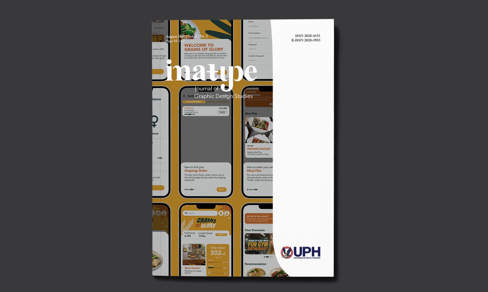
Perancangan Desain UI/UX untuk Aplikasi Restoran Makanan Sehat Grains of Glory
Caroline Heliawanto (Graphic Design 2019), Ellis Melini
Translated abstract:
The busy lifestyle has led to demands for convenience and practicality in various aspects. Almost every industry leverages technology to sustain its business, resulting in an increase in online food ordering through smartphone applications. Recognizing this, Grains of Glory aims to utilize technology to encourage and facilitate the community in adopting a healthier lifestyle. To achieve this goal, Grains of Glory plans to design a smartphone-based food ordering application.
To see more of IMATYPE, click the button below: